Quiz Funnel Landing Page: How to Design for Conversions
Learn how to design a quiz funnel landing page that earns more quiz starts, completions, qualified leads, and sales with practical tests and metrics.
Original illustration by GeniuzQuiz
A quiz funnel landing page is a focused web page that persuades a visitor to start an interactive quiz, complete it, and exchange contact details for a useful result. To convert, the page must align one audience promise, low-friction questions, a credible outcome, and a clear next step while removing competing choices.
Key takeaways
- Match the landing page headline to the ad, email, social post, or search result that brought the visitor.
- Sell the value of the personalized result, not the novelty of taking a quiz.
- Use one primary call to action and make the first question feel easier than filling out a form.
- Ask for contact information only after visitors have invested enough effort to want their results.
- Measure quiz starts, completions, leads, qualified leads, and downstream revenue separately.
Our practical design model is the MATCH framework: Message alignment, Answer promise, Trust evidence, Commitment curve, and Handoff. A high-converting quiz funnel landing page matches visitor intent, promises a useful answer, earns confidence, increases commitment gradually, and hands each lead to an appropriate next step.
What makes a quiz funnel landing page convert?
A converting quiz landing page does more than collect clicks. It establishes a clear value exchange: the visitor gives attention and information, while the business provides a personalized diagnosis, recommendation, score, plan, or product match. Visitors should understand that exchange within a few seconds.
The strongest pages answer five silent questions in order:
- Is this for someone like me? Name the audience, situation, or problem using language visitors recognize.
- What will I receive? Describe the result precisely, such as a skin-care routine, readiness score, software shortlist, or growth plan.
- How much work is involved? State the number of questions or realistic completion time.
- Can I trust the outcome? Explain what informs the recommendations and support the claim with relevant evidence.
- What happens next? Set expectations about results, email collection, booking, purchasing, or follow-up.
This sequence matters because a quiz requires more commitment than reading an article but can feel less demanding than completing a traditional lead form. The page must make personalization feel more valuable than the effort required.
Message match is especially important when traffic comes from Meta ads, paid search, creators, partner emails, or segmented campaigns. If an ad promises to identify a visitor's ideal running shoe, the landing page should repeat that outcome. A generic headline about finding better products introduces doubt and increases abandonment.
Trust should be proportional to the consequence of the recommendation. A lighthearted style quiz may need only a recognizable brand voice and privacy reassurance. A financial, health, education, or business assessment requires methodology, limitations, qualifications, and careful wording. Do not imply that a short marketing quiz provides a professional diagnosis.
How do you design a quiz funnel landing page step by step?
Step 1: Choose one conversion goal
Define the page's job before choosing colors or writing questions. The primary conversion might be a quiz start, but the commercial goal could be a qualified lead, booked consultation, product purchase, free-trial signup, or segmented email subscriber.
Write one sentence connecting both goals: The page should persuade qualified visitors to start the quiz so that the completed result leads them toward the most relevant offer. This prevents teams from optimizing quiz starts while attracting people who will never become customers.
Step 2: Identify the visitor's entry intent
Document the source, promise, audience awareness, and expected next step for each major traffic segment. Someone clicking a Meta ad may know little about the brand, while an email subscriber may already trust it. Search visitors may expect immediate information before interacting.
If different sources carry materially different promises, create dedicated page variants rather than forcing all visitors into one generic experience. Preserve consistent visual identity, but adjust the headline, supporting proof, and opening question.
Step 3: Write a result-led headline
Lead with the outcome, not with instructions to take a quiz. A useful formula is: Discover your specific result plus practical benefit. For example, a B2B consultant might use a headline about discovering the largest operational bottleneck and receiving a prioritized action plan.
Avoid unsupported superlatives, broad promises, and headlines that could fit any company. The word personalized is not enough. Name what will be personalized and how visitors can use it.
Step 4: Add a concise answer promise
Below the headline, explain the quiz's scope in one or two sentences. Include the approximate effort and result. For example, tell visitors that seven questions will produce a recommended solution category, the reasons it fits, and the next three actions.
A good promise is specific without overstating precision. If the quiz creates a directional recommendation, call it a recommendation rather than an exact diagnosis. Accuracy in the promise protects trust later in the funnel.
Step 5: Make the first action effortless
The primary button should describe the immediate action, such as starting the assessment or finding a match. Place it above the fold on common mobile screen sizes. Use sufficient color contrast, a comfortable touch target, and visible keyboard focus.
Consider placing the first question directly on the landing page when it is easy, relevant, and non-sensitive. Choosing a goal or preference often creates more momentum than clicking a generic start button. Do not begin with an email field, phone number, budget question, or lengthy open-text response.
Step 6: Add only decision-relevant proof
Use proof that makes the promised result more credible. Options include the number of people assessed, concise customer feedback, expert review, recognized customers, transparent methodology, data-source explanations, or product-review totals. Proof should support the quiz outcome rather than merely claim that the company is popular.
For testimonial copy, identify the customer's initial problem, the recommendation received, and the useful outcome. A vague statement that the quiz was amazing occupies space without resolving a buyer's concern.
Step 7: Remove competing exits
A dedicated quiz landing page usually needs less navigation than a homepage. Keep required legal and privacy links, but remove unrelated promotional banners, competing calls to action, autoplay media, and menus that invite browsing. The page should not feel deceptive or trapped; it should feel focused.
Step 8: Connect the result to the next step
Design the results experience before launching the landing page. Each result should explain the classification, reflect important answers, provide immediate value, and recommend a logical action. GeniuzQuiz can be used to build these branching quiz funnels and connect responses with segmented follow-up. Review the available features while mapping what data the result and handoff require.
What should a high-converting quiz page include?
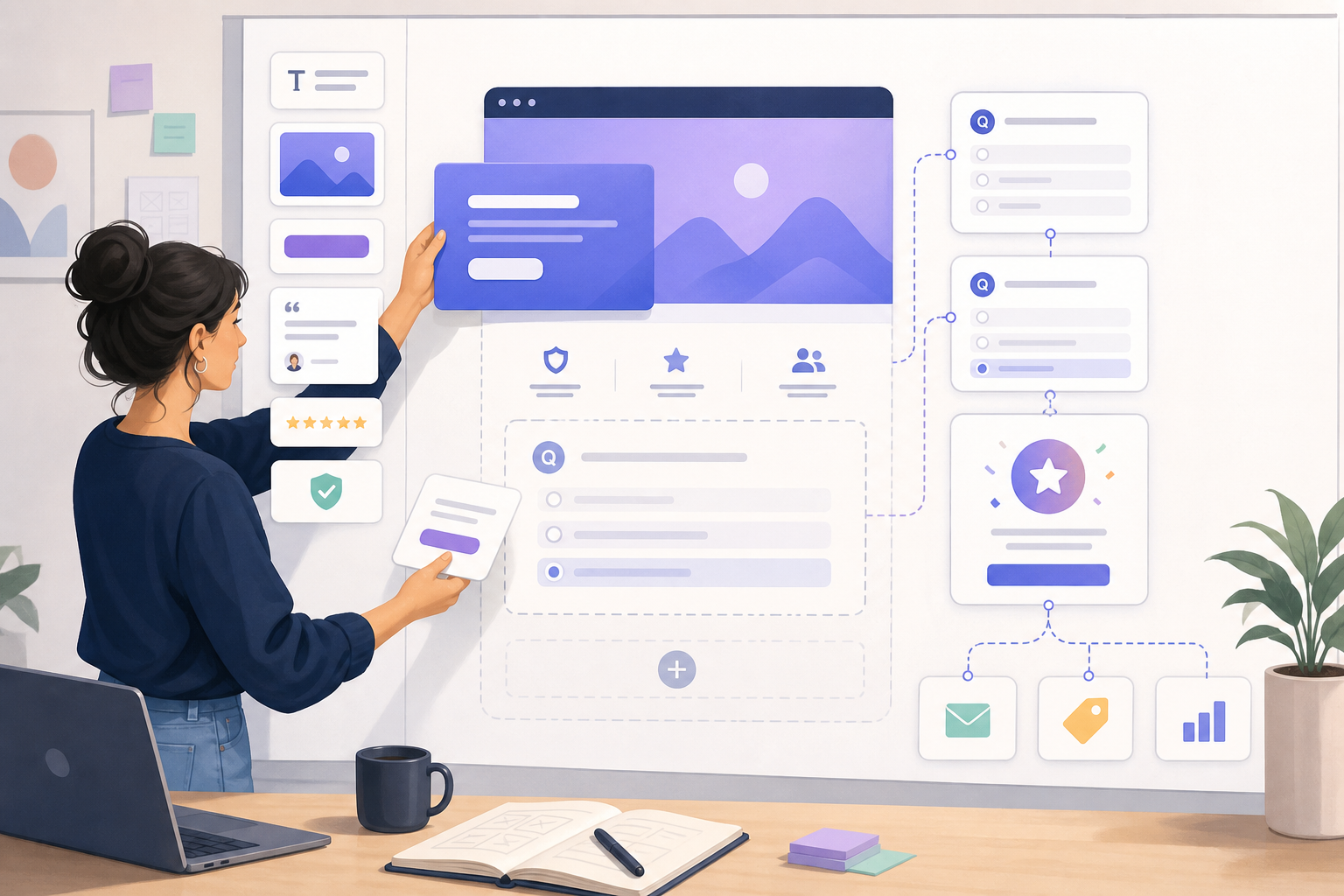
A quiz landing page does not need every conventional landing-page block. It needs enough information to make starting feel safe and worthwhile. Use this anatomy as a checklist, then remove any element that does not reduce uncertainty.
- Audience cue: A phrase, image concept, or problem statement that tells intended visitors the quiz is relevant to them.
- Result-led headline: A concise promise of the insight, score, recommendation, or plan they will receive.
- Support copy: One or two sentences explaining the benefit, effort, and intended use of the result.
- Primary call to action: One visually dominant button or an easy first question.
- Effort indicator: A truthful question count or time estimate, such as eight questions or about two minutes.
- Trust evidence: Proof matched to the risk and sophistication of the decision.
- Privacy cue: A concise explanation of how contact details and answers will be used.
- Expectation setting: A clear statement about whether results appear immediately, arrive by email, or lead to a consultation.
The best structure depends on traffic temperature and offer complexity. Use the following comparison as a starting point rather than a rigid rule.
| Page approach | Best suited to | Primary advantage | Main tradeoff |
|---|---|---|---|
| Short hero with start button | Warm audiences and simple quiz promises | Fast path to the first interaction | May not answer objections from unfamiliar visitors |
| First question above the fold | Low-risk topics with an easy opening question | Creates immediate behavioral commitment | Can feel abrupt when the outcome needs explanation |
| Hero plus proof and process | Cold paid traffic and considered purchases | Builds credibility before asking for effort | Extra content can distract if poorly prioritized |
| Educational landing page | Complex B2B, financial, health, or high-value services | Explains methodology and limitations | Longer pages may delay the quiz start |
Design for a visual hierarchy that survives scanning. The headline, promise, call to action, and strongest proof should remain understandable even if someone ignores the rest. Repeating the same claim in multiple blocks does not add clarity.
Use real page templates to accelerate production, but adapt the hierarchy to your audience and offer. GeniuzQuiz provides editable templates that can serve as a starting structure rather than a substitute for message research.
When should you ask for an email in a quiz funnel?
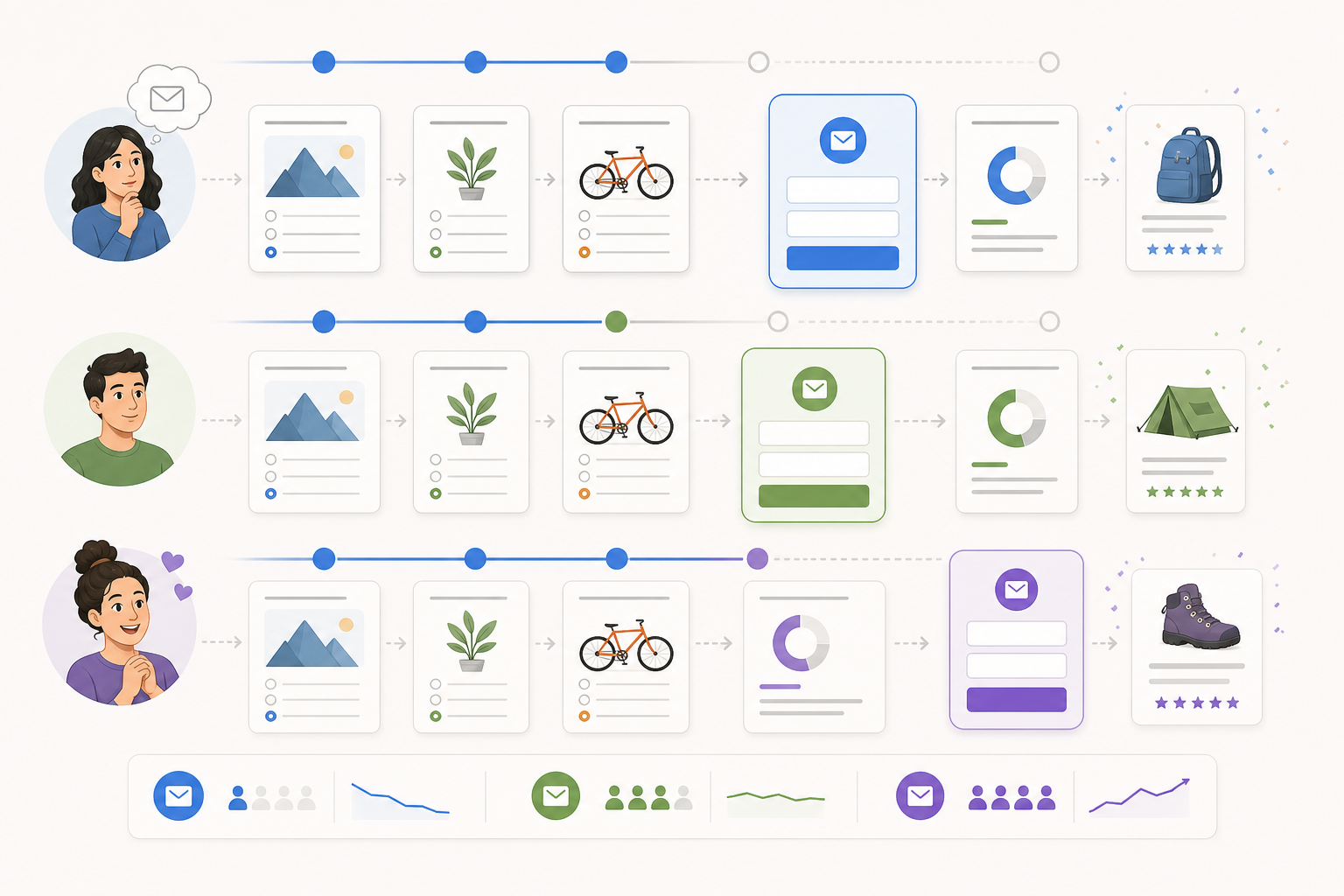
For most lead-generation quizzes, ask for an email after visitors answer the core questions but before revealing the complete personalized result. At that point, they have invested effort and understand what they will receive. This is commonly called a results gate.
However, there is no universally correct gate position. Choose it according to the visitor relationship, sensitivity of the questions, value of the result, and need to save progress.
- Before the first question: Useful when access is restricted, the audience is already warm, or saved progress is essential. It usually creates more start friction.
- Mid-quiz: Appropriate when an early mini-result proves value before the form. An unexpected gate can damage trust if the page implied that no signup was required.
- Before the full result: Often the strongest balance for lead generation because effort has increased result curiosity.
- After a useful result preview: Good for trust-sensitive audiences. Show a meaningful summary, then request an email for the full plan, comparison, or saved report.
- No gate: Suitable when the main goal is a purchase, recommendation click, or anonymous research rather than list growth.
Keep the form proportional to the promised value. Email alone maximizes simplicity, while name can support personalization. Phone number, company size, role, and budget may improve sales qualification but usually reduce form completion. Ask whether each field changes the result, routing, or follow-up. If it does not, collect it later.
Explain the exchange next to the form. State what visitors will receive, whether they will join an email list, and how often they can expect follow-up. Consent should be informed rather than hidden in vague button copy. For regulated markets, obtain legal guidance appropriate to the jurisdictions where the funnel operates.
Avoid fabricating progress, withholding a promised free result, or presenting a mandatory sales call as though it were an instant report. These tactics may raise short-term lead counts while reducing trust, lead quality, and future conversion.
How should the quiz experience work on mobile?
Mobile design is not a reduced desktop layout. Many quiz funnels receive most of their traffic from Meta ads, Instagram, TikTok, email apps, and mobile search. Test the entire path on physical devices, including the landing page, questions, form, results, calendar, checkout, and confirmation.
Use one main idea per screen. Keep question wording short, make answer cards easy to tap, and avoid tiny radio controls. Buttons should not sit beneath browser controls or keyboard overlays. If an answer list is long, ensure the selected state remains obvious after scrolling.
Performance also affects conversion. Compress media, limit third-party scripts, reserve space for elements to prevent layout shifts, and avoid loading unnecessary video before interaction. A fast first screen is particularly important for paid mobile traffic, where visitors may be using a weak connection.
Accessibility improves both reach and usability. Every control should have a meaningful label, sufficient contrast, logical focus order, and keyboard operation. Do not communicate selected answers or errors through color alone. Error messages should identify the problem and explain how to fix it.
Progress indicators can reduce uncertainty, but they must be honest. A question count is generally clearer than a progress bar when branching logic gives visitors different path lengths. Let users move backward without losing prior answers, and explain when an answer cannot be changed because it triggered an irreversible action.
How do you test and measure quiz landing page performance?
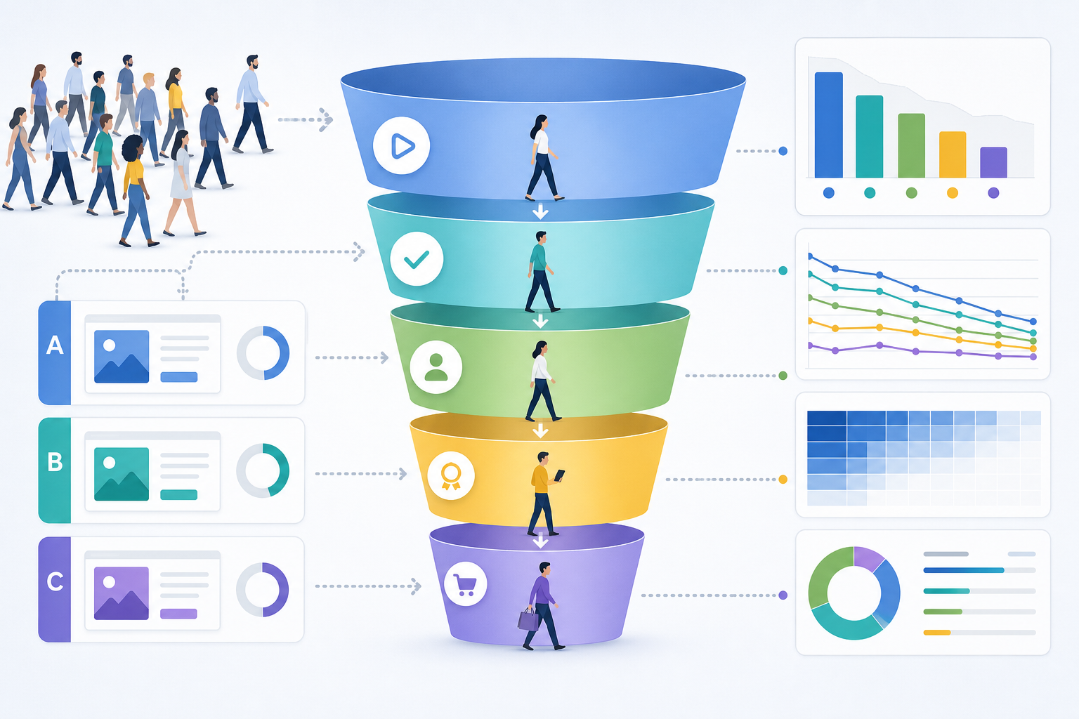
Do not judge the page by its email opt-in rate alone. A high opt-in rate can conceal poor traffic quality, weak quiz completion, irrelevant recommendations, or an ineffective sales handoff. Build a measurement chain from arrival to commercial outcome.
- Landing page view to quiz start rate: Quiz starts divided by valid landing page views.
- Quiz completion rate: Visitors who reach the final form or result divided by quiz starters.
- Lead conversion rate: Valid contacts captured divided by landing page views or quiz starters. Label the denominator consistently.
- Qualified lead rate: Leads meeting agreed fit and intent criteria divided by all leads.
- Result-to-action rate: Visitors taking the recommended next step divided by visitors who see a result.
- Revenue per visitor: Attributed revenue divided by valid landing page views.
Track abandonment by question. A sharp drop often signals sensitive wording, unclear answers, excessive effort, technical failure, or a mismatch between the initial promise and the information requested. Segment the data by device, browser, source, campaign, and result type before changing the entire funnel.
There is no reliable universal benchmark for a good quiz landing page conversion rate. Traffic temperature, category, incentive, device mix, brand trust, and the definition of conversion vary too widely. Establish a baseline using qualified traffic, then improve the weakest meaningful stage without sacrificing downstream quality.
Test one business hypothesis at a time
A useful test states why the change should affect behavior. For example: making the personalized deliverable more specific should increase starts because visitors can better understand the value. Compare that with merely testing two button colors, which rarely addresses the largest source of uncertainty.
Prioritize tests involving message match, result promise, first-question friction, proof, effort disclosure, gate timing, form fields, and result calls to action. Run a test long enough to capture normal weekday and weekend variation. Avoid declaring a winner after a small early swing.
Evaluate quality as well as quantity
A variant that produces more leads can still lose if those leads unsubscribe, provide false information, fail qualification, or ignore the recommended offer. Define a guardrail metric before launch, such as qualified lead rate, booked-call attendance, purchase rate, refund rate, or revenue per visitor.
For longer sales cycles, connect quiz responses and result categories to the customer relationship management system. Review whether specific outcomes predict closed revenue. This turns the quiz from a lead magnet into a source of declared preference and intent data.
Use a prelaunch quality checklist
- Confirm that campaign promise, landing headline, questions, and result tell one consistent story.
- Test every branch, result, form validation rule, automation, and destination link.
- Verify analytics events once, without duplicate page views or conversions.
- Check mobile layouts, keyboard behavior, load time, and accessibility.
- Submit test leads with different answers and confirm correct segmentation.
- Review privacy language, consent, data retention, and deletion procedures.
- Document the baseline and test hypothesis before sending paid traffic.
When evaluating software, include implementation speed, branching logic, integrations, analytics, brand control, and traffic volume in the cost calculation. Published pricing can help compare the platform expense with the operational cost of custom development and maintenance.
Frequently asked questions
What is the difference between a quiz landing page and the quiz itself?
The landing page persuades visitors that the interaction is relevant, valuable, credible, and worth starting. The quiz collects answers and creates momentum toward a result. Some funnels combine them by placing the first question in the hero section, but the two functions remain distinct and should be measured separately.
How long should a quiz funnel landing page be?
It should be long enough to resolve the uncertainty created by the offer and no longer. Warm visitors taking a simple preference quiz may need only a headline, short promise, effort estimate, and button. Cold visitors considering a high-value service may need methodology, proof, privacy details, limitations, and an explanation of what follows.
How many questions should a lead-generation quiz have?
Use the fewest questions required to produce a credible result and useful segmentation. Many practical quizzes can work with roughly five to twelve focused questions, but complexity should determine the count. Remove any question that does not change the result, lead routing, personalization, or a defined business decision.
Should I show the first quiz question on the landing page?
Yes, when the first question is easy, non-sensitive, and directly related to the promised result. It can turn passive interest into active participation. Use a conventional start button instead when visitors need context, consent, or trust information before answering.
What call-to-action text works best for a quiz funnel?
Use specific text that describes the immediate action or outcome, such as starting an assessment, finding a match, or calculating a score. The best wording depends on what happens after the click. Avoid promising to reveal a result when the next screen only begins a lengthy questionnaire.
Should quiz results be free?
Most lead-generation quizzes should provide a genuinely useful free result because that is the promised value exchange. A business can charge for a deeper report, implementation, consultation, product, or service afterward. The free result should stand on its own rather than functioning as an empty teaser.
Can a quiz funnel landing page rank in Google or appear in AI Overviews?
It can, but a thin page containing only a headline and embedded quiz offers search engines and generative systems little context. Add concise, indexable information about the quiz's purpose, audience, methodology, expected result, privacy, and limitations. GEO supports machine understanding, but useful content, technical accessibility, clear entities, and reputable evidence remain essential.
What is the biggest quiz landing page mistake?
The most common mistake is optimizing for curiosity without establishing outcome value. Visitors may start a playful quiz but abandon it, submit low-quality details, or ignore the result. Design backward from the useful result and commercial handoff, then ensure every page element attracts the people that outcome can genuinely help.